New baby giraffe

Can you tell I’ve had a day off today? Including some crafty purchases and some playing with ink and paint and paper…

Here is a card for someone who is expecting a new baby in a couple of weeks. Just time to get people to sign it 🙂  The first time in ages I’ve used patterned paper: I have SOOO much of it (just managed to resist buying more today)!

This one was inspired by Jenni’s card at  Muse Challenge #208

and also entered in The Paper Players Clean and simple baby cards – just under the wire…


Save

Carry on cycling

This is for a colleague’s birthday next weekend – he’s in training for a charity bike ride.

Just a Hobbycraft vintage bicycle stamp and a free sentiment, Palette and Memento inks, with a stroke of watercolour, but I’m pleased with it. (Oh, and a bit of bling…)

adventure bike

This is for Seize the Birthday “Black and White and one more colour”

and Watercooler Wednesday Masculine Anything Goes


The haiku for this one:

Go, race to the end:
Enjoy the speed as the air
Rushes past your face

Save

Save

Bluebird of Happiness

Here is a card stamped with watercolour pens and Inkadinkadoo Delicate Branches. Love that sketchy watercolour look. Not sure why the Old Olive has come out so brown though!

bluebird of happiness

This is for CAS Colours and Sketches (I did it before I looked at Emily’s card so it’s not a CASE!). That lovely blue made me think straightaway of the bluebird of happiness…

It will have an insert with the sentiment: May you find your bluebird of happiness.

   Also for

Freshly Made Sketches – two branches for Linda’s sketch. However, the sentiment didn’t look right in exactly the same place as on the sketch so I moved it…

And today’s haiku:

The bluebird flies by
Try catch that happy feeling
Though ephemeral…

L is for Lighthouse

I haven’t had much time to create cards this weekend, but managed one tonight.

Here is a CAS lighthouse intended for a friend going through difficulties.

L is for lighthouse

I want to enter this one for Just Add Ink – #351 Just Add L 

L is of course for lighthouse.


and Addicted to CAS Seaside challenge – I was gutted I didn’t get a doodled card done in time for their Doodle challenge!


Save

Up in the air

Balloons are the theme of my last couple of cards.  This one is in yellow, purple and white, with a charcoal grey sentiment. Watercolouring, stamping and hand cutting.  I was going to have two balloons on each card and a bigger yellow panel, but cutting it down to match the shape of the square card base and having two clouds to make up the Power of Three seemed to work better.

This one is entered in CAS Colours and Sketches #213.  I couldn’t put too much grey in it, as it would have looked rainy instead of a sunny adventure!


Also in CAS-ual Fridays Off The Edge challenge

and though balloons are unisex I think this one is more masculine so entering at Cards 4 Guyz CAS challenge #160

I did another version of this. In orange and yellow instead – trying to give it a gentler look. I think I prefer it with the purple and grey though.

Entering this one in Cards in Envy: Keep it simple

and Seize the Birthday: Anything Goes

My balloon flies off.
Watching it drift in the blue,
I wish I could too…

Save

White agapanthus

Yet more agapanthus. My go-to stamp so many times. This time it’s white embossed on a watercoloured background.  I painted then stamped and embossed. Next time I might try a resist technique and see if it works better.

I used the colours from Color Throwdown #433  green, blue and white.

Also entered into The Flower Challenge #6 for March. Anything Goes

Colours are too bright
Red, orange, yellow: give me
Peaceful blue and green


Save

Save

Cog in the machine

I love the idea of steampunk. Jules Verne, H G Wells, Dr Who, Warehouse 13, etc. So many interesting motifs for masculine cards: cogs, balloons, goggles, watches, top hats.  And a great theme for an escape game… Last time I went to a steampunk fair I came away with loads of steampunk themed charms to make cards – and have I used them? No!  Not sure why I haven’t been very inspired with cards.  Although I was pleased with this one.

Such a good idea for The Male Room to have a Steampunk challenge.  I started with card faintly patterned with clocks and added balloons, more clocks and cogs.  Can you see the ironic element of my picture? 😉

An unusual haiku this time:

The highwayman coat
Caught his eye but was too small 🙁
Incentive to slim…

Spring greens

I find one-layer cards really difficult. You need good stamps, good inks and good technique, and I can rarely manage all three! This one is the best I could manage in the time I had for it today…

Clearly Besotted leaf stamp, Papermania sentiment, olive pastel chalk ink and Docrafts green (which is currently all over my fingers!)

This is a one layer card for Less is More’s challenge #319 One-layer Leaves


and the colours are taken from The Paper Players Green and White challenge #335 from Jaydee

Leaves unfurl on trees,
green building upon green, then…
cherry blossom time!

Sweets for the sweet

When I saw the cue card at CASOLOGY I didn’t think I’d have any stamps suitable. I was toying with something about the “crunch” of exercise but that was even more unlikely!

Bringing in the lime and aqua and the image from The Card Concept #68 made me think of jars of peppermint sweets, with the sweets scattered about, and that led me to this (after a lot of false starts!):

Clearly Besotted stamps and watercolours.

Entered in CASOLOGY #238


and Watercooler Wednesday WWC108 Gail’s Sketch challenge

with inspiration for this Clean and Layered card from The Card Concept #68- March 1 {Lime & Aqua}

Also entered in The Paper Players #334 Cut it Out as the sweets and jar are fussy cut.

Save

Save

Save

Terrifically teal and aqua

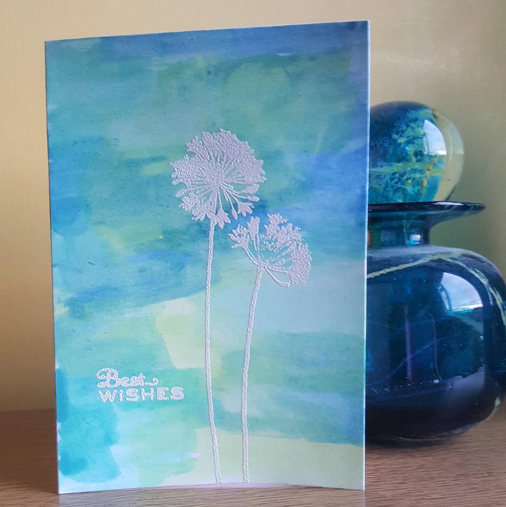
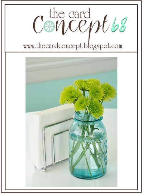
I love turquoise, teal, aqua. My favourite colours. This year there’s more teal around, some of it a little too much towards green. And a few of the challenges are reflecting this colourway at the moment. More on The Card Concept’s lime and aqua later, but because I love this colour I have different cards for each challenge.

Here’s my first attempt at emboss resist, inspired by Michelle’s so pretty card at Muse Challenge #205. I’ve taken some of the colours and much of the design from her card. I was a little disappointed by the lack of definition on this Crafty Individuals feather stamp. But I may try it with a different stamp. It uses Colorbox chalk and Hobbycraft inks. It’s more aqua than it looks in the pic where it seems bluer. It’s a very dull and rainy day today for card pics!


The next card is for Less is More’s TEAL challenge


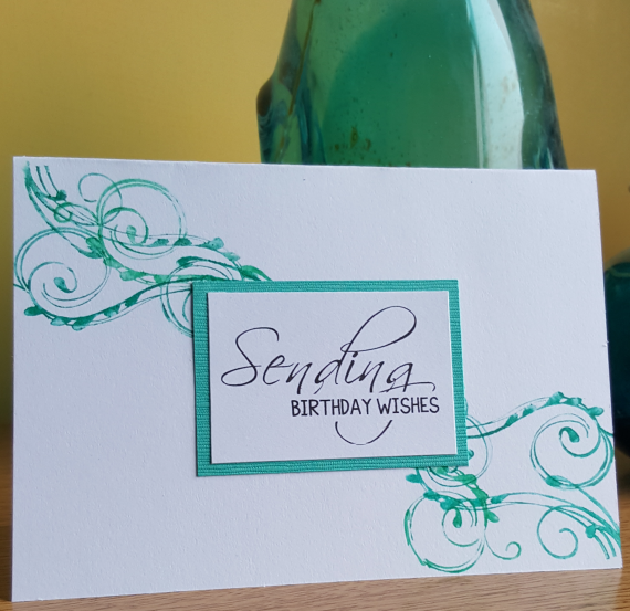
This seems a versatile design, and one I’ve had in my head for a while. This is an old but trusty Autumn Leaves Rhonna Farrer swirls stamp and some lovely embossed card for the mat that I’ve been hoarding. But it’s there to be used isn’t it? I was trying for a bit of a shabby feel rather than very crisp stamping. I think it flows better. (I’m unlikely to achieve a perfect finish anyway!)  There are three different colours of watercolour pen on there.

The haiku for these:

Trying to make sense:
Events swirl around me like
Feathers, not controlled

Save

Save

Save

Save

Previous Older Entries Next Newer Entries